

The original element of technology is present in my redesign:


The chest symbol is re-visioned to fit my new take on the character:
As would the case be in a professional environment, I explored drastically different takes on the character. But I settled on a design rather similar in its nature to what is generally expected to be seen in a superhero film: A simple silhouette, a tight-fitting costume and the familiarity of the superhero symbol.


Character Exploration: from a campy 50's inspired jet-pack to a knight that has adapted the sigil of a scarab with blue painted armour.
I took a more realistic science-oriented direction in tune with the DC cinematic universe at the moment (e.g. 'Man of steel' 2013) through the concept of nanotechnology. To further suggest that they are a part of the same league, I used slightly darker, muted colours with an emphasis on blues and cyans.
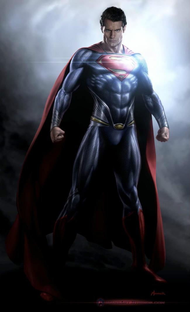


The 'Man of Steel '(2013) concept art has the casting choice in mind, thus showing how the film would look and feel.
I worked with a 'cast actor' in order to pitch my idea of the film more convincingly, as would the case be in industry. Then I additionally investigated at how the costume would work on camera, which is crucial to designing for motion pictures:

No comments:
Post a Comment