Thursday, 29 May 2014

1. Demonstrate a comprehensive and critical understanding of the techniques and methods relevant to visual storytelling in various contexts.

Through this module we explored every major technique and method for visually conveying narrative elements: Teasers, Posters, Key Moments and Storyboards. In order to illustrate the peculiarities of each method relevant to visual storytelling, I will use Marvel's Avengers as an example:


Teasers:


The purpose of teaser images are to create and maintain an awareness of a product, while giving the most basic information about it. The teaser below does exactly this - it generates brand awareness and gives the basic important of roughly when it will be available and who is involved in making it. A teaser poster normally includes  memorable and recognisable logo, that would be carried through the entire marketing campaign:

Poster:


Similarly to a teaser, a poster is also made for marketing purposes but it includes more visual information about the product it is advertising. It must present an accurate depiction of what the audience should expect from the experience. Though sometimes what or who is popular can influence the images in order to maximise the success of a given product. For example on the first poster below the central figure is Robert Downey Jr as Ironman with his helmet removed, since Ironman is the most popular franchise in the individual Marvel films:

 Live Action Film                Lego Video Game         Animated TV Series

Key Moments:


Key moments are illustrations made for internal studio use, although they are often released as marketing material. They combine all design decisions with narrative elements to display  a complete visualisation of a scene. The key moment illustration below includes all final character design and maintains the likeness of the actors involved, so it can also serve as concept art. Apart from that it includes a narrative scenario, a colour scheme, composition and a location. In a way the example below even represents the nature of the entire film -  an on-screen team-up of all those famous Marvel superheroes:

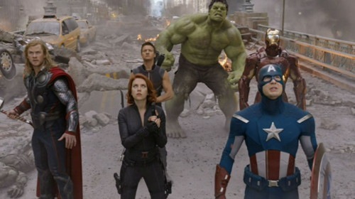
Key Moment Illustration                      Still from the Film

Storyboard:


Storyboarding is the most direct representation of visual storytelling. In less detail than a key moment drawing, a storyboard breaks down individual shots to help plan scenes, sets and VFX elements. They are made for the visually literate people on a project - the cinematographer, the director, animators etc:


2. Demonstrate a systematic and critical understanding of the breadth and depth of knowledge in a range of techniques and methods appropriate to the field of visual storytelling.

All techniques and methods investigated in Learning Outcome 1, have been applied in my work on the Marketing Images and Storyboards for the Excelsior brief . Issues regarding each individual technique and method would be thoroughly explored throughout the following Learning Outcomes:

3.  Research and synthesise diverse visual materials to inform design solutions.

5.  Plan and implement appropriate skills in the creation of visual work.

6.  Systematically gather and evaluate information from a diverse range of sources relevant to visual storytelling.

7.  Demonstrate independent learning and continued personal development.

8.  Reflect on practice and identify strengths and weaknesses in own work.


Peter Amachree Workshop image

3. Research and synthesise diverse visual materials to inform design solutions.

Storyboarding was a particular challenge. With these types of drawings one must be very selective in what they show, and what to spent their efforts on. To prepare myself for the task of creating storyboards, I looked at a number of references to find examples of elements specific to the script provided. I investigated the issue to an extent in Learning Outcome 1, showing how action and combat can be represented in a storyboard.

Another major part of the script is dialogue. Personally I experienced confusion in the way panels are represented with comic book panels. I needed to understand that storyboards are their own medium with a specific set of visual rules. I found two interesting examples to help me break down the conversation shots:

(Taxi Driver)

Deadwood )


The storyboard from Taxi Driver establishes the composition more than anything else. It also has the transition from outdoors to indoors, which is included in the Excelsior script as well. While the storyboard from Deadwood are more about the dialogue and mannerisms of the actors. 

Interesting about them both is how roughly drawn they are. They just provide the basic compositional information. This suggests that the storyboards were done by a visually literate person for another. In the storyboards I wanted to make, I was looking for more visual clarity. Additionally I wanted to make myself more comfortable with sketching digitally the way I sketch with a pencil on paper. A great reference for a storyboard with the look I required is from Game of Thrones

(Game Of Thrones)

The way the storyboards above communicate complex panoramic scenes, dialogue and camera movement is very clear and aesthetic. In response to all these synthesised visual materials, I produced this series of storyboard panels:

4. Develop argued conclusions regarding industry and professional requirements.

There are a series of rules one should abide to in order to be perceived as a professional in the industry:

  • To be able to work in tight requirements: within a brief/style-guide.
  • Respect the opinions and desires of a clients.
  • Being adaptable.
  • To respect the agreements in a contract. 
  • Keeping within deadline.
  • To thoroughly researching work: brand, historical accuracy, demographic, genre, target audience etc.
  • To use a method/technique relevant to task at hand.
  • To be aware of whether the artwork is for  visually literate or not and to act accordingly.
  • To create artwork in direct response to a brief.
  • To be systematic in the quality of produced images.
  • Plagiarism is not allowed in any professional environment.
  • To be aware of what is at the cutting edge of the industry.


5. Plan and implement appropriate skills in the creation of visual work.

The poster I created appropriately uses a realistic painting style, as should be done for a marketing image.  Since the project is for a potential video game, I researched video game posters and promo art. I found that in action-adventure games it is customary to focus the advertising around the main protagonist:


I decided to do the same in my poster and teasers, it would also be a great opportunity to push my character design further than I had previously in the Character and Environment Design module:


The final poster can be seen below:

6. Systematically gather and evaluate information from a diverse range of sources relevant to visual storytelling.

Creating a teaser poster must create excitement among the target audience without revealing too much of what the property in question is about. I explored teaser posters to an extent in Learning Outcome 1, but the example provided there is from a very well-known property - Marvel's Avengers. In order to approach the creation of my teasers I needed to find examples from original an IP and understand how they generate brand awareness:

All the examples I found below seem to start with an interesting and memorable logo,  including an element that makes them interesting and original. Pacific Rim for example is an original, unknown property. It has a memorable logo, with a portal behind it hinting to it fantastical elements. Another  shows the massive scale difference between the robots and people, which makes it quite memorable.

 For my teasers I continued the original character concept from the Character and Environment Design module of  looking interesting in motion, while fighting. I came up with the idea of fire-dancing to amplify that for the teasers. So I created a series of thumbnails in different compositions fitting the required dimensions for teaser images:


Then I paired some of them up in threes to follow a narrative  of a battle slowly teasing and revealing the character:


I pick a set that gradually amplifies the heat degree of flames and of action. 


I painted the teasers in a realistic style, fitting a marketing image,  and then I added a memorable logo to unify all the individual teasers into a marketing campaign:


7. Demonstrate independent learning and continued personal development.

In order to progress and develop professional I critically evaluated my strengths and weaknesses as an artist. I realized that depth, value and composition are not as good as they could be in my artwork.I found the best way to address these issues is through speed-painting.


Speed-painting requires one to work in a organised and systematic manner and thus allowing for art to reach a certain level of completeness sooner. I believe it is important for a concept artist to be able to communicate concepts and ideas fast. For reference  I looked at the work of artist Jonas de RoAs evident in his portfolio, by starting with a clean idea of values, it is immensely easier and faster to work up images further while making them look more 'finished' faster.

Jonas de Ro speedpaints


By looking at his artwork I realized he starts with quick polygon lasso tool shapes t determine the values and colour of the image straight away. Then he refines those shapes further with rough brushes and textures. My process can be seen below:


The next step in my personal development would be to investigate values and composition through doing speed-paint studies of cinematic stills from films and TV.